

How to read this article
- Pick the decision first: What are you trying to decide (release date, scope tradeoff, flow health, or risk escalation)?
- Then pick the chart: Use the smallest chart that answers that decision.
- Treat charts as system diagnostics: If a chart becomes a performance scoreboard, you’ll get gaming instead of signal.
🧭 TL;DR: Agile progress charts are not “status.” They’re a way to make scope volatility, flow constraints, and risk visible early enough to steer.
Progress reporting in Agile
Progress charts are not decoration. They are decision tools. In high-stakes engineering environments (including regulated work), “status” is cheap but predictability and objective evidence are not.
A good progress chart does three things:
- It makes reality legible to the right audience.
- It exposes tradeoffs (scope, time, risk, capacity) early enough to act.
- It creates a shared language for continue / pivot / pause / stop decisions.
A bad progress chart does the opposite: it creates the illusion of control, and it pushes teams toward “looking on track” rather than being on track.
Chart Selection Guide
Use this when you need to choose quickly:
- “Are we done yet, given scope changes?”
- → Feature chart (total vs done vs remaining)
- “Are we converging on a release?”
- → Release burnup (scope vs done, optionally with forecast)
- “Is flow healthy day-to-day?”
- → Cumulative flow diagram (CFD)
- “How predictable are we?”
- → Control chart (cycle time)
- “Which work items are silently dying?”
- → Aging WIP (WIP age)

A feature chart is a scope-and-delivery view that speaks in features rather than task-level noise. It tends to work well with sponsors because it answers the two questions everyone actually asks:
- How much is left?
- Are we converging?
What it is
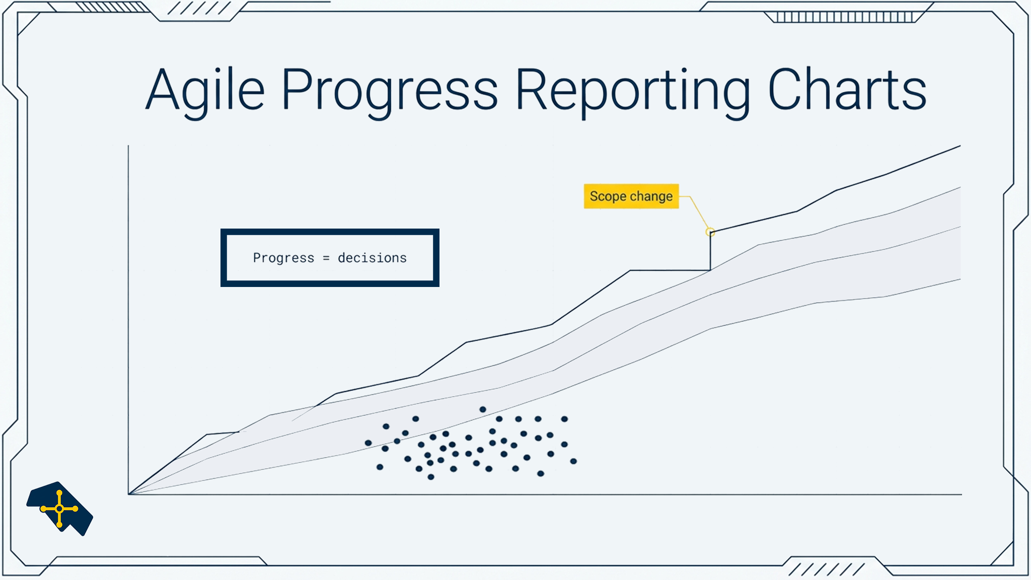
A feature chart typically shows three lines over time:
- Total features (scope): a burnup line that can move up/down as scope evolves
- Features complete (accepted): burnup of “done-done”
- Features remaining: the implied gap between total and complete
Why it exists
Teams need a way to talk about progress without arguing about story points, and without hiding scope growth behind a “% complete” number.
A feature chart makes scope volatility visible and forces an honest conversation:
- Are we adding work faster than we complete it?
- Are we actually finishing (accepted), or just moving cards?
- Are we converging on a milestone, or just staying busy?
How to use it
- Read the slope of “complete.” If it flattens, you likely have a flow constraint or an acceptance bottleneck.
- Read the slope of “total.” If it climbs continuously, you have a scope boundary problem (or discovery is still active).
- Watch the gap (remaining). If remaining is not shrinking, you’re not converging, regardless of how “busy” the board looks.
- Use it for governance decisions. When remaining is stable or growing, make the tradeoff explicit: reduce scope, add capacity, change sequencing, or revise the milestone.
When not to use it
- If “feature” isn’t defined consistently, the chart becomes a political weapon.
- If acceptance is delayed (work is “done” but not accepted), the chart punishes the team for a stakeholder/system bottleneck.
- If features vary wildly in size, pair this chart with cycle time or forecasting to avoid false confidence.
Common failure patterns
- Treating backlog items as “features” without a definition of done
- Freezing scope to make the chart look good (status theater)
- Using the chart to pressure teams instead of surfacing constraints
ccontinue block

Sprint burndown is the classic agile chart: remaining work inside an iteration.
What it is
A line chart that shows remaining work (tasks, hours, or points) versus time inside a sprint.
Why it exists
It answers: “Are we on track to finish what we committed to in this iteration?”
It’s a short feedback loop chart, not a long-range forecasting tool.
How to use it
- Use it daily to detect mid-sprint drift: blocked work, WIP pileups, late testing
- Look for late drops: that often means work is being integrated/validated at the end (late risk discovery)
When not to use it
- In knowledge work, remaining work estimates can be noisy. If the team spends more energy fixing the chart than finishing work, stop using it.
- If work isn’t sliced well, burndown becomes a flat line until the last day (false signal).
Common failure patterns
- Tracking hours without improving slicing and flow
- Treating a flat burndown as “team failure” instead of a work-design signal

Release burnup is the more honest sibling of burndown when scope changes.
What it is
Two lines over time:
- Total scope (features/stories planned for the release)
- Done scope (completed/accepted)
Why it exists
It answers: “Are we converging on a release goal, even while scope evolves?”
How to use it
- Watch total scope: if it climbs continuously, you don’t have a delivery problem, you have a scope boundary problem
- Add a vertical marker for release date if there is a fixed milestone
- If you have enough data, add a forecast band rather than a single-point guess
When not to use it
- If “done” is not acceptance-based, the chart will lie.
- If you’re in heavy discovery, use learning metrics rather than pretending you’re in convergence.
Common failure patterns
- Declaring “done” without validation/integration
- Hiding unplanned work in “ops” so the release looks stable

CFD is the best chart for “is flow healthy?” because it makes WIP visible.
What it is
A stacked area chart showing counts of work items in each workflow state over time (e.g., To do / In progress / Review / Done).
Why it exists
It answers:
- Is WIP stable or ballooning?
- Where is work accumulating (bottleneck)?
- Is throughput consistent?
How to use it
- Look for widening bands in a state: that’s your bottleneck
- Look for continuous growth in in progress: that’s WIP inflation (context switching)
- Watch the “done” slope: that’s your throughput signature
When not to use it
- If workflow states don’t reflect reality (or people skip states), the CFD becomes a fiction.
- If work items are too large, the CFD becomes slow and uninformative.
Common failure patterns
- Too many states (hard to read)
- Using CFD as a scoreboard instead of a system diagnostic

If you want predictability, cycle time is the measurement that matters.
What it is
A scatterplot of cycle time (Y) over completion date (X), often with a median and percentile bands.
Why it exists
It answers:
- Are we becoming more predictable?
- What does “typical” look like vs outliers?
- What lead time should we forecast with?
How to use it
- Use percentiles (e.g., 50th / 85th) rather than a single average
- Investigate outliers: they often reveal dependency friction, batching, or approval bottlenecks
- Separate item types if needed (bugs vs features vs large initiatives)
When not to use it
- If you don’t have consistent “start” and “done” definitions, cycle time will be garbage.
- If work isn’t sliced well, variability will swamp the signal.
Common failure patterns
- Using cycle time to judge individuals (destroys trust and data integrity)
- Mixing incomparable item types without segmentation

This is the chart that prevents “in progress” from becoming a graveyard.
What it is
A chart showing active items and how long they’ve been in progress (often as bars, sorted by age).
Why it exists
It answers: “Which items are silently dying?”
It’s a risk and escalation tool, not a productivity chart.
How to use it
- Set a policy threshold (e.g., “flag items older than X days”)
- Use it in standups to drive unblocking, de-scoping, or escalation decisions
- Pair it with WIP limits (otherwise you’re diagnosing the symptom forever)
When not to use it
- If the team uses it to punish, people will game statuses.
- If work is often paused for valid reasons, add explicit pause states and policies.
Common failure patterns
- No threshold (so it becomes “interesting data” with no action)
- Treating age as a moral failure rather than a system signal
“Don’t lie to yourself”
This is the part that matters most in real delivery:
- If “done” isn’t accepted, your charts are optimistic fiction.
- If scope is undefined, your charts are storytelling.
- If WIP is unmanaged, your charts will predict chaos accurately, but won’t fix it.
Charts are signal amplifiers. If your system is unhealthy, the chart will either (a) show the truth and make people uncomfortable, or (b) get weaponized and become theater.
Closing: the chart is not the work
If you only remember one line: progress reporting is a way to force tradeoffs into daylight. When charts are used well, they protect value delivery by making scope volatility, flow constraints, and risk visible early enough to act.
When charts are used badly, they produce the illusion of control, right up until the moment reality forces the decision anyway.


Leave a Reply